Introduction to On-Chain Analysis
2022-01-04 10:07:50Index1: Long-Term Bitcoin Holders
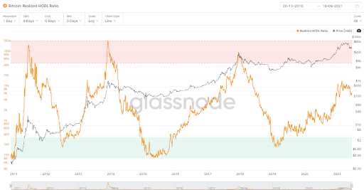
As shown on the graph, the black line is Bitcoin price while the blue line represents the amount of Bitcoin held by long-term holders. The definition of long-term here is for owning the asset for at least 155 days.
According to historical data, the long-term holder position change indicator and Bitcoin price have negative correlation(black and blue lines). When holders are buying up Bitcoin, the price usually goes down. Otherwise, the price goes up. Analysts give the reason behind the move. Because long-time holders sell their assets to short-time holders who frequently buy on the upside and sell on the downside.
Index2: Bitcoin Illiquid Supply Relative Strength Index
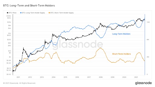
When the index goes up higher than the purple area, it means the market enters into the phase of supply squeeze where Bitcoin faces a supply shortage in the market.
Index3: Bitcoin Balance on Exchanges
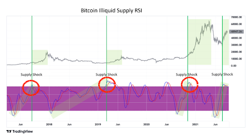
If the exchanges’ Bitcoin balance continues shrinking, it indicates more people are positive about it so that investors are buying up.
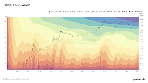
Index4: Hodl Waves
Index5: Balance of Long-Term and Short-Term Bitcoin Holders
The blue line, meaning the long-term holder supply is still increasing. The yellow line represents the short-term holder supply and the black line means the BTC price.

Index6: Mining Hash Rate
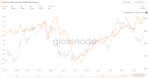
Hash Rate can be understood as the difficulty of mining. The larger the Hash Rate, the more the miners. When the hash rate increases, it also means it is harder to mine BTC.
We can learn from the graph that the Mean Hash Rate went to the bottom and rebounded in July, which means the profits of miners were decreasing and more miners were flooding to mine BTC.
Index7: Miner Net Position
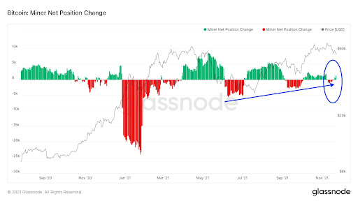
The number of Miner Net Position turns to positive from a negative number. Instead of mine and sell, the miners were piling up BTC. The circulating Bitcoin in the market are often new coins. When the miners are unwilling to sell their holdings, supply squeeze may happen soon.
Index8: USDT Supply on Exchanges
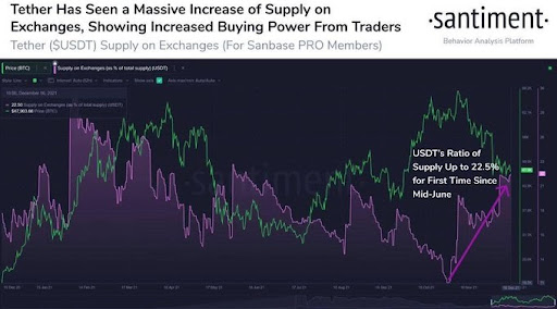
How to recognize if it is a bull or bear market? Investors usually witness an enormous increase of stablecoin supply during a bull market and the supply is for pumping the spot trading instead of futures trading.
Index9: Realized HODL Ratio
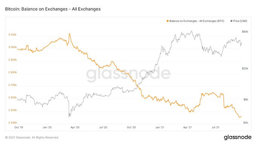
When the orange line (Realized HODL Ratio) goes higher, it means the short-time holders are more. The 2011, 2013 and 2017 bull markets proved the Ratio could be a way to recognize a bull or bear market.
